类型:区块 · 分类:未分类 · 收录:2026-09-03 19:57:57 · 源码:会员可见
Build a single, complete, self-contained HTML file named index.html that reproduces the
"Nietzsche — Sustainability" hero/footer plate EXACTLY as specified below. Output the whole
file, nothing else. No frameworks, no build step, no external CSS/JS. All CSS goes in one
<style> block in <head>; one tiny inline <script> before </body>.

════════════════════════════════════════════════════════════════════════════
0. WHAT THIS IS
════════════════════════════════════════════════════════════════════════════
A full-viewport composition built from four stacked planes:

  z1  .sky    — a smooth cloudless sky gradient photograph, full stage
  z2  .panelbg— a solid white panel (the footer plate)
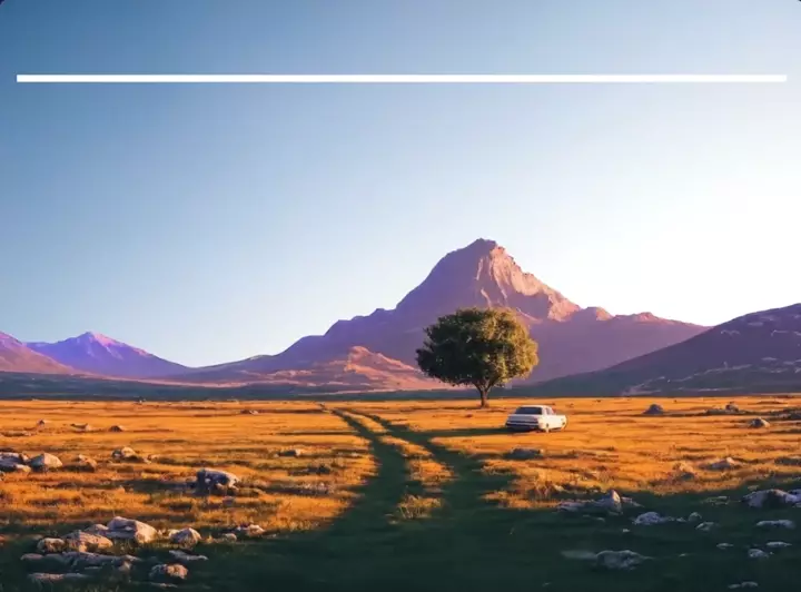
  z3  .scene  — a transparent-PNG landscape (mountains, lone tree, dirt track,
                white pickup, golden grass) whose ridge line rises OVER the
                white panel's lower half
  z4  .content— all typography and icons, above the white panel

The desktop layout is a fixed-proportion artwork. Every length is a multiple of one
reference pixel --px = 100vw/7556 (the master artboard is 7556px wide), so the entire
screen scales as a single piece and every measured gap keeps its exact ratio. Do not
substitute rem/em/px for these calc() values — reproduce them literally.

════════════════════════════════════════════════════════════════════════════
1. ASSETS (use these exact URLs — do not download, do not localize)
════════════════════════════════════════════════════════════════════════════
SKY (background plane):
https://d8j0ntlcm91z4.cloudfront.net/user_38xzZboKViGWJOttwIXH07lWA1P/hf_20260827_202248_5e838477-28e2-425b-a444-4facfdf2c2af.png

LANDSCAPE (foreground plane, transparent PNG):
https://soft-zoom-63098134.figma.site/_assets/v11/ab9f88c78cba09e8b4e89f27cc91691623c21909.png

Both are 2528x1696. Both are painted with `center top / 100% 100% no-repeat` on desktop.

FONT — Host Grotesk, variable weight axis 300–800, loaded from a local file:
  assets/host-grotesk-variable.woff2   (format 'woff2-variations', font-display:block)
If that file is unavailable, substitute the Google Fonts release of Host Grotesk
(https://fonts.googleapis.com/css2?family=Host+Grotesk:wght@300..800&display=block) —
but keep the @font-face family name 'Host Grotesk' and the same fallback stack.

════════════════════════════════════════════════════════════════════════════
2. DOCUMENT SHELL
════════════════════════════════════════════════════════════════════════════
<!DOCTYPE html><html lang="en"><head>
<meta charset="utf-8">
<meta name="viewport" content="width=device-width, initial-scale=1, viewport-fit=cover">
<title>Nietzsche — Sustainability</title>

════════════════════════════════════════════════════════════════════════════
3. CSS — reproduce verbatim
════════════════════════════════════════════════════════════════════════════
@font-face{
  font-family:'Host Grotesk';
  font-style:normal;
  font-weight:300 800;
  font-display:block;
  src:url(assets/host-grotesk-variable.woff2) format('woff2-variations');
}

:root{
  --font-sans:'Host Grotesk',system-ui,-apple-system,'Segoe UI',Roboto,sans-serif;
  --wght-wordmark:800;
  --wght-navhead:426;
  --wght-link:384;
  --wght-display:455;
  --wght-body:394;
  --ink:#000000;
  --ink-muted:#575757;
  --rule:#5E5E5E;
  --entrance-shift:clamp(9px,1.05vw,16px);
  --ease-entrance:cubic-bezier(.16,1,.3,1);
  --ease-structure:cubic-bezier(.65,0,.35,1);
}

*,*::before,*::after{box-sizing:border-box;margin:0;padding:0;}
html,body{height:100%;}
body{
  background:#0d1c14;
  font-family:var(--font-sans);
  font-synthesis-weight:none;
  -webkit-font-smoothing:antialiased;
  text-rendering:geometricPrecision;
}

.viewport{position:fixed;inset:0;overflow:hidden;background:rgb(8,24,17);}
.stage{
  --px:calc(100vw / 7556);
  position:absolute;left:0;top:0;
  width:100vw;
  height:max(100svh, calc(100vw / 1.5003971));
  --drop:max(0px, calc(100svh - 100vw / 1.5003971));
  background:rgb(8,24,17);
}

.sky{
  position:absolute;left:0;top:0;width:100%;height:100%;
  background:url(<SKY URL>) center top / 100% 100% no-repeat;
  filter:url(#skyTone);
  z-index:1;
}

.board{
  position:absolute;
  left:calc(158 * var(--px));
  top:calc(157 * var(--px) + var(--drop));
  width:calc(7240 * var(--px));
  height:calc(2528 * var(--px));
}
.panelbg{position:absolute;inset:0;background:#fff;border-radius:0;z-index:2;}
.content{position:absolute;inset:0;z-index:4;}

.scene{
  position:absolute;left:0;top:var(--drop);width:100%;
  height:calc(100vw / 1.5003971);
  background:url(<LANDSCAPE URL>) center top / 100% 100% no-repeat;
  filter:url(#fgTone);
  z-index:3;pointer-events:none;
}

.lockup{position:absolute;left:calc(118 * var(--px));top:calc(142 * var(--px));
  display:flex;align-items:flex-start;}
.mark{width:calc(192 * var(--px));height:calc(192 * var(--px));display:block;
  fill:#F5480F;flex:none;}
.wordmark{
  position:absolute;left:calc(238 * var(--px));
  top:calc(9.59 * var(--px));
  font-size:calc(127 * var(--px));font-variation-settings:'wght' var(--wght-wordmark);
  letter-spacing:0.0278em;line-height:1.33;color:var(--ink);white-space:nowrap;
}

.navcol{position:absolute;left:calc(var(--cl) * var(--px));top:0;}
.navhead{
  position:absolute;left:0;
  top:calc(108.79 * var(--px));
  font-size:calc(121 * var(--px));font-variation-settings:'wght' var(--wght-navhead);
  letter-spacing:-0.0183em;line-height:1.33;color:var(--ink);white-space:nowrap;
}
.navlist{position:absolute;left:0;top:calc(319.1 * var(--px));list-style:none;}
.navlist li{height:calc(138 * var(--px));}
.navlist a{
  display:inline-block;
  font-size:calc(84.3 * var(--px));font-variation-settings:'wght' var(--wght-link);
  letter-spacing:-0.0469em;line-height:calc(138 * var(--px));
  color:var(--ink-muted);text-decoration:none;white-space:nowrap;
  transition:color .18s ease;
}
.navlist a:hover,.navlist a:focus-visible{color:var(--ink);}

.rule{position:absolute;
  left:calc(117 * var(--px));
  top:calc(1081.5 * var(--px));
  width:calc(6991 * var(--px));
  height:max(1px, calc(4.9 * var(--px)));
  background:var(--rule);
}

.display{
  font-size:calc(159.5 * var(--px));font-variation-settings:'wght' var(--wght-display);
  letter-spacing:-0.0236em;
  line-height:calc(192 * var(--px));
  color:var(--ink);
}
.pitch{position:absolute;left:calc(117 * var(--px));
  top:calc(1322.98 * var(--px));width:calc(1900 * var(--px));}
.blurb{position:absolute;left:calc(117 * var(--px));
  top:calc(1747.75 * var(--px));width:calc(1900 * var(--px));
  font-size:calc(84.3 * var(--px));font-variation-settings:'wght' var(--wght-body);
  letter-spacing:-0.0513em;line-height:calc(98.5 * var(--px));color:var(--ink-muted);
}

.socials{position:absolute;left:calc(5317 * var(--px));top:calc(1322.98 * var(--px));}
.soc{
  position:absolute;
  left:calc((var(--sl) - 5317) * var(--px));
  top:calc((1593 - (1322.98)) * var(--px));
  width:calc(var(--sw) * var(--px));
  height:calc(158 * var(--px));
  display:block;color:var(--ink);
  transition:opacity .18s ease;
}
.soc svg{width:100%;height:100%;display:block;fill:currentColor;}
.soc:hover,.soc:focus-visible{opacity:.62;}

a:focus-visible{outline:calc(3 * var(--px)) solid #F5480F;outline-offset:calc(6 * var(--px));}

/* ---- one-time entrance ---- */
@keyframes entrance-panel{
  from{clip-path:inset(0 0 100% 0);}
  to{clip-path:inset(0 0 0 0);}
}
@keyframes entrance-settle{
  from{opacity:0;transform:translate3d(0,var(--entrance-shift),0);}
  to{opacity:1;transform:none;}
}
@keyframes entrance-type{
  from{opacity:0;clip-path:inset(0 0 100% 0);transform:translate3d(0,calc(var(--entrance-shift) * 1.15),0);}
  to{opacity:1;clip-path:inset(0 0 0 0);transform:none;}
}
@keyframes entrance-rule{
  from{transform:scaleX(0);}
  to{transform:scaleX(1);}
}

.panelbg{animation:entrance-panel 720ms var(--ease-structure) 0ms backwards;}
.lockup{animation:entrance-settle 640ms var(--ease-entrance) 260ms backwards;}
.navcol{animation:entrance-settle 660ms var(--ease-entrance) backwards;}
.navcol:nth-child(1){animation-delay:360ms;}
.navcol:nth-child(2){animation-delay:410ms;}
.navcol:nth-child(3){animation-delay:460ms;}
.navcol:nth-child(4){animation-delay:510ms;}
.rule{transform-origin:left center;
  animation:entrance-rule 720ms var(--ease-entrance) 680ms backwards;}
.pitch{animation:entrance-type 860ms var(--ease-entrance) 830ms backwards;}
.blurb{animation:entrance-settle 620ms var(--ease-entrance) 1170ms backwards;}
.socheading{animation:entrance-type 680ms var(--ease-entrance) 940ms backwards;}
.socrow{animation:entrance-settle 600ms var(--ease-entrance) 1230ms backwards;}
.entrance-complete .panelbg,
.entrance-complete .lockup,
.entrance-complete .navcol,
.entrance-complete .rule,
.entrance-complete .pitch,
.entrance-complete .blurb,
.entrance-complete .socheading,
.entrance-complete .socrow{animation:none;}

/* ===== TABLET / NARROW: breakpoint derived from this design's own type scale.
   Body copy is 84.3 ref px; at 1180px it renders ~13.2px, the last width where
   the muted #575757 smallest type stays readable. Below it, --px is PINNED per
   tier (narrower must never mean smaller) while the panel stays fluid, and
   spacing keeps the desktop's own vw ratios so gutters cross the breakpoint
   continuously. ===== */
@media (max-width: 1179.98px){
  html,body{height:auto;}
  .viewport{position:static;inset:auto;overflow:visible;height:auto;}
  .stage{
    --px:0.170px;
    --gutter:clamp(20px, 2.091vw, 26px);
    --pad:clamp(17px, 1.588vw, 20px);
    --ridge:clamp(22px, calc(14svh - 6vw), 200px);
    position:relative;height:auto;min-height:100svh;
    display:flex;flex-direction:column;
  }
  .sky{position:absolute;inset:0;height:auto;background-size:cover;}
  .board{
    position:relative;left:auto;top:auto;width:auto;height:auto;
    flex:1 1 auto;display:flex;flex-direction:column;
    margin:var(--gutter) var(--gutter) 0;
  }
  .content{
    position:relative;inset:auto;
    padding:calc(142 * var(--px)) var(--pad)
            calc(clamp(60px, 8vw, 110px) + var(--ridge));
    flex:1 1 auto;
    display:grid;align-items:start;align-content:start;
    row-gap:clamp(30px, 5.5svh, 76px);
    grid-template-columns:minmax(0,1fr) auto;
    grid-template-areas:"brand brand" "nav nav" "rule rule" "pitch socials";
    column-gap:calc(300 * var(--px));
  }
  .lockup{grid-area:brand;position:relative;left:auto;top:auto;
    align-items:center;gap:calc(46 * var(--px));margin-bottom:0;text-decoration:none;}
  .mark{flex:none;}
  .wordmark{position:relative;left:auto;top:auto;line-height:1;}
  .navwrap{grid-area:nav;display:grid;
    grid-template-columns:repeat(4,minmax(0,1fr));
    gap:calc(210 * var(--px)) calc(150 * var(--px));}
  .navcol{position:relative;left:auto;top:auto;}
  .navhead{position:relative;top:auto;margin-bottom:calc(110 * var(--px));line-height:1;}
  .navlist{position:relative;top:auto;}
  .rule{grid-area:rule;position:relative;left:auto;top:auto;width:100%;
    margin:calc(90 * var(--px)) 0;}
  .pitchgroup{grid-area:pitch;min-width:0;}
  .pitch,.blurb,.socials{position:relative;left:auto;top:auto;width:auto;}
  .pitch{line-height:1.16;max-width:19ch;}
  .pitch br{display:none;}
  .blurb{margin-top:calc(70 * var(--px));line-height:1.42;max-width:52ch;}
  .socials{grid-area:socials;justify-self:end;}
  .socheading{margin-bottom:calc(110 * var(--px));line-height:1;}
  .socrow{display:flex;align-items:center;gap:calc(118 * var(--px));}
  .soc{position:relative;left:auto;top:auto;
    width:calc(var(--sw) * var(--px));height:calc(158 * var(--px));}
  .scene{
    position:relative;left:auto;top:auto;
    margin-top:calc(-22.6vw - var(--ridge));
    width:100%;height:auto;
    min-height:66.67vw;max-height:74vw;
    flex:6 1 auto;
    background-position:center top;background-size:cover;
  }
}

/* ===== MOBILE: measured, not assumed. The four sitemap tracks hold their
   longest link ("Download for Android") down to 680px and overflow at 660px,
   so the tablet architecture is kept alive to 680 rather than folding at a
   conventional 768. Only the sitemap halves. ===== */
@media (max-width: 679.98px){
  .stage{--px:0.180px;}
  .navwrap{grid-template-columns:repeat(2,minmax(0,1fr));
    gap:calc(190 * var(--px)) calc(150 * var(--px));}
}

/* ===== PHONE: one composed plate, not a narrow document. Same DOM and same
   semantic order; the grid becomes height-aware, the landscape becomes a fixed
   bottom layer instead of contributing another 3:2 block to document height,
   and --px is bounded by BOTH viewport axes so short phones compact without
   making tall phones needlessly small. No scrolling. ===== */
@media (max-width: 569.98px){
  html,body{width:100%;height:100%;overflow:hidden;}
  .viewport{position:fixed;inset:0;width:100%;height:100svh;overflow:hidden;}
  .stage{
    --px:clamp(0.135px,
      min(0.180px, calc(100vw / 2100), calc(100svh / 4200)),
      0.180px);
    --phone-gutter:clamp(10px,3.2vw,16px);
    --phone-scene:clamp(172px,32svh,300px);
    position:relative;width:100%;height:100svh;min-height:0;
    display:block;overflow:hidden;
  }
  .board{
    position:absolute;left:var(--phone-gutter);right:var(--phone-gutter);
    top:var(--phone-gutter);bottom:0;
    width:auto;height:auto;margin:0;display:block;
  }
  .content{
    position:absolute;inset:0;height:100%;
    padding:calc(92 * var(--px)) clamp(12px,4vw,18px)
      calc(var(--phone-scene) - 18px);
    display:grid;align-content:space-between;align-items:start;
    grid-template-columns:minmax(0,1fr) auto;
    grid-template-areas:"brand brand" "nav nav" "rule rule" "pitch socials";
    column-gap:calc(100 * var(--px));
    row-gap:calc(68 * var(--px));
  }
  .navwrap{grid-template-columns:repeat(2,minmax(0,1fr));
    gap:calc(84 * var(--px)) calc(110 * var(--px));}
  .navhead{margin-bottom:calc(54 * var(--px));}
  .navlist li{height:calc(110 * var(--px));}
  .navlist a{line-height:calc(110 * var(--px));}
  .rule{margin:0;}
  .pitch{max-width:17ch;}
  .blurb{margin-top:calc(54 * var(--px));line-height:1.34;max-width:31ch;}
  .socials{justify-self:end;margin-top:0;}
  .socheading{margin-bottom:calc(58 * var(--px));}
  .socrow{gap:calc(62 * var(--px));}
  .scene{
    position:absolute;left:0;right:0;bottom:0;top:auto;
    width:100%;height:var(--phone-scene);min-height:0;max-height:none;
    margin:0;display:block;flex:none;
    background-position:center top;background-size:cover;
  }
}

/* Short phone landscape: same grid and content, remapped for the shallower
   viewport so nothing clips and no scrolling appears. */
@media (max-width: 569.98px) and (max-height:480px) and (orientation:landscape){
  .stage{
    --px:clamp(0.112px,calc(100svh / 2700),0.125px);
    --phone-scene:clamp(76px,26svh,120px);
  }
  .content{
    padding-top:calc(56 * var(--px));
    padding-bottom:calc(var(--phone-scene) - 12px);
    row-gap:calc(36 * var(--px));
  }
  .navwrap{grid-template-columns:repeat(4,minmax(0,1fr));gap:0 calc(40 * var(--px));}
  .navhead{margin-bottom:calc(34 * var(--px));}
  .navlist li{height:calc(96 * var(--px));}
  .navlist a{line-height:calc(96 * var(--px));}
  .pitch{max-width:22ch;}
  .blurb{margin-top:calc(34 * var(--px));max-width:45ch;}
  .socheading{margin-bottom:calc(38 * var(--px));}
  .socrow{gap:calc(44 * var(--px));}
  .scene{background-position:center 42%;}
}

@media (prefers-reduced-motion: reduce){
  *{transition:none !important;animation:none !important;}
}

════════════════════════════════════════════════════════════════════════════
4. BODY — colour-grading filters (first element in <body>)
════════════════════════════════════════════════════════════════════════════
<svg width="0" height="0" style="position:absolute" aria-hidden="true" focusable="false">
  <filter id="skyTone" color-interpolation-filters="sRGB">
    <feColorMatrix type="matrix" values="
      1.3020 0 0 0 -0.0662
      0 1.3197 0 0 -0.0942
      0 0 1.2713 0 -0.1655
      0 0 0 1 0"/>
  </filter>
  <filter id="fgTone" color-interpolation-filters="sRGB">
    <feColorMatrix type="matrix" values="
      0.9206 0 0 0 0.0516
      0 0.9093 0 0 0.0575
      0 0 0.8767 0 0.0778
      0 0 0 1 0"/>
  </filter>
</svg>

════════════════════════════════════════════════════════════════════════════
5. BODY — structure
════════════════════════════════════════════════════════════════════════════
<div class="viewport">
  <div class="stage">
    <div class="sky" role="presentation"></div>

    <footer class="board">
      <div class="panelbg"></div>
      <div class="content">

        <a class="lockup" href="#" aria-label="Nietzsche — home">
          <svg class="mark" viewBox="0 0 192 192" aria-hidden="true"> ...12 rects... </svg>
          <span class="wordmark">Nietzsche</span>
        </a>

        <nav class="navwrap" aria-label="Footer"> ...4 .navcol blocks... </nav>

        <div class="rule" role="presentation"></div>

        <div class="pitchgroup">
          <h2 class="pitch display">Sustainability for the <br>upcoming generation</h2>
          <p class="blurb">Designing systems, products, and environments that
            protect our planet while empowering future generations to thrive.</p>
        </div>

        <div class="socials">
          <h2 class="socheading display">Socials</h2>
          <div class="socrow"> ...4 .soc links... </div>
        </div>

      </div>
    </footer>

    <div class="scene" role="presentation"></div>
  </div>
</div>

--- LOGO MARK: a 12-spoke asterisk/sun, orange #F5480F, inside viewBox "0 0 192 192".
Emit exactly 12 <rect> elements, identical except for the first rotate angle N,
where N runs 4, 34, 64, 94, 124, 154, 184, 214, 244, 274, 304, 334 (30° apart,
offset 4°). Each spoke is also given a 10° skew about its own base point:

<rect x="87.70" y="0.00" width="16.60" height="57.00" rx="1.2"
      transform="rotate(N 96.0 96.0) rotate(10 96.0 28.50)"/>

--- NAV COLUMNS: four <div class="navcol" style="--cl:VALUE">, each containing
<h2 class="navhead">HEAD</h2> and <ul class="navlist"> of
<li style="--i:INDEX"><a href="#">LABEL</a></li> (index restarts at 0 per column):

  --cl:3776  "Main"         → Home · Early Access · Projects · Blog
  --cl:4532  "Company"      → About Us · Careers · Sustainability
  --cl:5362  "Application"  → Download for iOS · Download for Android
  --cl:6438  "Legal Pages"  → Privacy Policy · Terms & Conditions · Cookie Policy

--- SOCIAL LINKS: four <a class="soc" href="#" aria-label="..." style="--sl:X;--sw:Y">,
each wrapping one inline <svg aria-hidden="true">. Order and vars:

  GitHub    --sl:5317 --sw:158
  Facebook  --sl:5592 --sw:158
  Threads   --sl:5868 --sw:133
  X         --sl:6119 --sw:148

GitHub — <svg viewBox="0.0000 0.2970 24.0000 23.4057" preserveAspectRatio="none">
<path d="M12 .297c-6.63 0-12 5.373-12 12 0 5.303 3.438 9.8 8.205 11.385.6.113.82-.258.82-.577 0-.285-.01-1.04-.015-2.04-3.338.724-4.042-1.61-4.042-1.61C4.422 18.07 3.633 17.7 3.633 17.7c-1.087-.744.084-.729.084-.729 1.205.084 1.838 1.236 1.838 1.236 1.07 1.835 2.809 1.305 3.495.998.108-.776.417-1.305.76-1.605-2.665-.3-5.466-1.332-5.466-5.93 0-1.31.465-2.38 1.235-3.22-.135-.303-.54-1.523.105-3.176 0 0 1.005-.322 3.3 1.23.96-.267 1.98-.399 3-.405 1.02.006 2.04.138 3 .405 2.28-1.552 3.285-1.23 3.285-1.23.645 1.653.24 2.873.12 3.176.765.84 1.23 1.91 1.23 3.22 0 4.61-2.805 5.625-5.475 5.92.42.36.81 1.096.81 2.22 0 1.606-.015 2.896-.015 3.286 0 .315.21.69.825.57C20.565 22.092 24 17.592 24 12.297c0-6.627-5.373-12-12-12"/></svg>

Facebook — <svg viewBox="0.0000 0.0440 24.0000 23.9120" preserveAspectRatio="none">
<path d="M9.101 23.691v-7.98H6.627v-3.667h2.474v-1.58c0-4.085 1.848-5.978 5.858-5.978.401 0 .955.042 1.468.103a8.68 8.68 0 0 1 1.141.195v3.325a8.623 8.623 0 0 0-.653-.036 26.805 26.805 0 0 0-.733-.009c-.707 0-1.259.096-1.675.309a1.686 1.686 0 0 0-.679.622c-.258.42-.374.995-.374 1.752v1.297h3.919l-.386 2.103-.287 1.564h-3.246v8.245C19.396 23.238 24 18.179 24 12.044c0-6.627-5.373-12-12-12s-12 5.373-12 12c0 5.628 3.874 10.35 9.101 11.647Z"/></svg>

Threads — <svg viewBox="1.1680 0.0000 21.6650 24.0000" preserveAspectRatio="none">
<path d="M18.263 11.097c-.03-3.486-1.92-5.586-5.111-5.586-2.13 0-3.922.963-4.863 2.499l2.062 1.438c.535-.843 1.272-1.543 2.628-1.543 1.528 0 2.318.85 2.544 2.431a15 15 0 0 0-2.236-.173c-4.125 0-6.068 1.867-6.068 4.336s1.943 3.99 4.804 3.99c3.139 0 5.013-2.115 5.781-4.735.798.361 1.348 1.204 1.348 2.47 0 3.387-3.907 5.232-7.22 5.232-4.885 0-8.077-3.207-8.077-8.424 0-6.392 4.223-10.487 9.9-10.487 3.808 0 5.69 1.671 6.97 3.914l2.108-1.475C21.44 2.078 18.331 0 13.663 0 6.227 0 1.168 5.277 1.168 12.934c0 7 4.953 11.066 10.856 11.066 4.878 0 9.809-2.846 9.809-7.716 0-2.545-1.46-4.231-3.569-5.187m-6.33 4.855c-1.077 0-2.026-.512-2.026-1.453 0-1.483 1.822-1.934 3.606-1.934.678 0 1.34.045 1.927.173-.422 1.927-1.671 3.215-3.508 3.214Z"/></svg>

X — <svg viewBox="0 0 148 158"> (NO preserveAspectRatio attribute; two crossing bars)
<path d="M0 0 H20 L148 158 H128 Z"/><path d="M148 0 H128 L0 158 H20 Z"/></svg>

════════════════════════════════════════════════════════════════════════════
6. SCRIPT (before </body>) — freezes the entrance so it plays exactly once
════════════════════════════════════════════════════════════════════════════
<script>
if(!window.matchMedia('(prefers-reduced-motion: reduce)').matches){
  document.querySelector('.socrow').addEventListener('animationend',function(){
    document.documentElement.classList.add('entrance-complete');
  },{once:true});
}
</script>

════════════════════════════════════════════════════════════════════════════
7. ANIMATION INTENT (must match, do not embellish)
════════════════════════════════════════════════════════════════════════════
One coordinated entrance, then absolute stillness — no loops, no hover-scale,
no scroll effects, no parallax. The sky and landscape are deliberately EXCLUDED:
they are the static stage. Only the white structure, grouped navigation, divider
and editorial content are introduced, resolving to the exact authored resting
state. Timeline: panel wipes up 0→720ms, lockup 260ms, nav columns stagger
360/410/460/510ms, rule draws left→right at 680ms, pitch types up at 830ms,
socials heading 940ms, blurb 1170ms, social row 1230ms (last — its animationend
sets the freeze class). All use `backwards` fill so nothing flashes pre-paint.

════════════════════════════════════════════════════════════════════════════
8. ACCEPTANCE CHECKS
════════════════════════════════════════════════════════════════════════════
- 1920x1280: composition matches the 7556-wide master's ratios; landscape ridge
  overlaps the white panel's lower half; zero horizontal scrollbar.
- 1180px vs 1179px: gutter and padding change continuously, no visual jump.
- 680px vs 679px: sitemap goes 4 columns → 2 columns, nothing else moves.
- 390x844 (iPhone): everything fits one screen, no scrolling, landscape pinned
  to the bottom as a fixed-height layer, socials right-aligned beside the pitch.
- 844x390 (landscape phone): sitemap returns to 4 columns, still no scrolling.
- prefers-reduced-motion: reduce → page renders instantly in final state.
- Keyboard Tab: every link shows an orange #F5480F focus ring.
- Exactly two raster images requested over the network, both from the URLs in §1;
  no local image files referenced anywhere.